

Monday, December 12, 2011
Life is looking Good.
Another campaign that involved a Bike Launch for Honda across Europe. This time, it was for the brand new Honda Integra. A Honda that doesn't really have a category within bikes. Its a bit like a scooter but with the power of a bigger bike and was created to bridge the gap between the everyday need for practicality and the desire for a more powerful, refined ride. The Integra is the considered choice for any discerning rider. We needed to communicate to the audience a stylish, cool and sophisticated bike. No spotty teenage, hairdryer scooter riders here! Photography and film by Adam Swords.

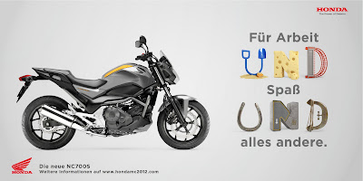
AND Honda
Below are some pieces from a Campaign we did to launch the new NC700x and Nc700S across Europe. The concept revolved around the insight that the NC700 can used for anything from an everyday commute to a trip in the countryside. To show the versatility of the bike we decided to amplify the roads and areas the bike can go to. Each cgi "AND" has been lovingly crafted by Chris Labrooy. Each typeface has been created by objects or items found in each environment. The press was also accompanied by a product film (see previous blog post)


Monday, November 14, 2011
BT DMA awards 2011
Our campaign this year involved a online battle between fans to try and claim a virtual wall with their favorite artist poster.
Italy
Two new product videos i art directed in Italy in the summer for two Honda Bike Launches. The Integra and Nc700S/X.
Press ads to accompany the films coming soon.
Press ads to accompany the films coming soon.
Tuesday, May 3, 2011
CRV HONDA Press Ad

The CRV is capable of driving on a variety of road surfaces and weather conditions. We wanted to dramatise this product truth. The illustration style comes from looking at old national geographic and technical geology drawings by the likes of James Sowerby. Again each illustration was produced to mimic the car's overall shape. For example the worm is used to highlight the top of a Tyre.
Friday, April 15, 2011
Honda National Press Ad
Here is the first of our national press ads. The idea is that we have taken a product truth and amplified it. So the jazz is has magic seats that can change to 180 combination, enabling you to arrange your car around your life.
The style was influenced by Swiss style art direction, every object and layout is engineered and considered. With classic red Swiss typeface overlayed giving these ads a non traditional car ad feel. Each illustration was also painstakingly considered and drawn with a technical, lifelike style. Each object also resembles or hints to the cars shape and defining features to make the whole piece succinct. Come back to see the rest of the series soon.

The style was influenced by Swiss style art direction, every object and layout is engineered and considered. With classic red Swiss typeface overlayed giving these ads a non traditional car ad feel. Each illustration was also painstakingly considered and drawn with a technical, lifelike style. Each object also resembles or hints to the cars shape and defining features to make the whole piece succinct. Come back to see the rest of the series soon.

Thursday, April 7, 2011
BT DMA Awards
Here's some work we produced as part of the annual BT Digital Music Awards. The purpose, to get fans to vote for their favorite artists and increase awareness of the awards.
Our idea was to hero the fans,after all it's the fan's who make the artist. See the video for a better overview.
Our idea was to hero the fans,after all it's the fan's who make the artist. See the video for a better overview.
BT DMA Case Study from Crayon London on Vimeo.
Tuesday, January 18, 2011
Inspiration is everywhere
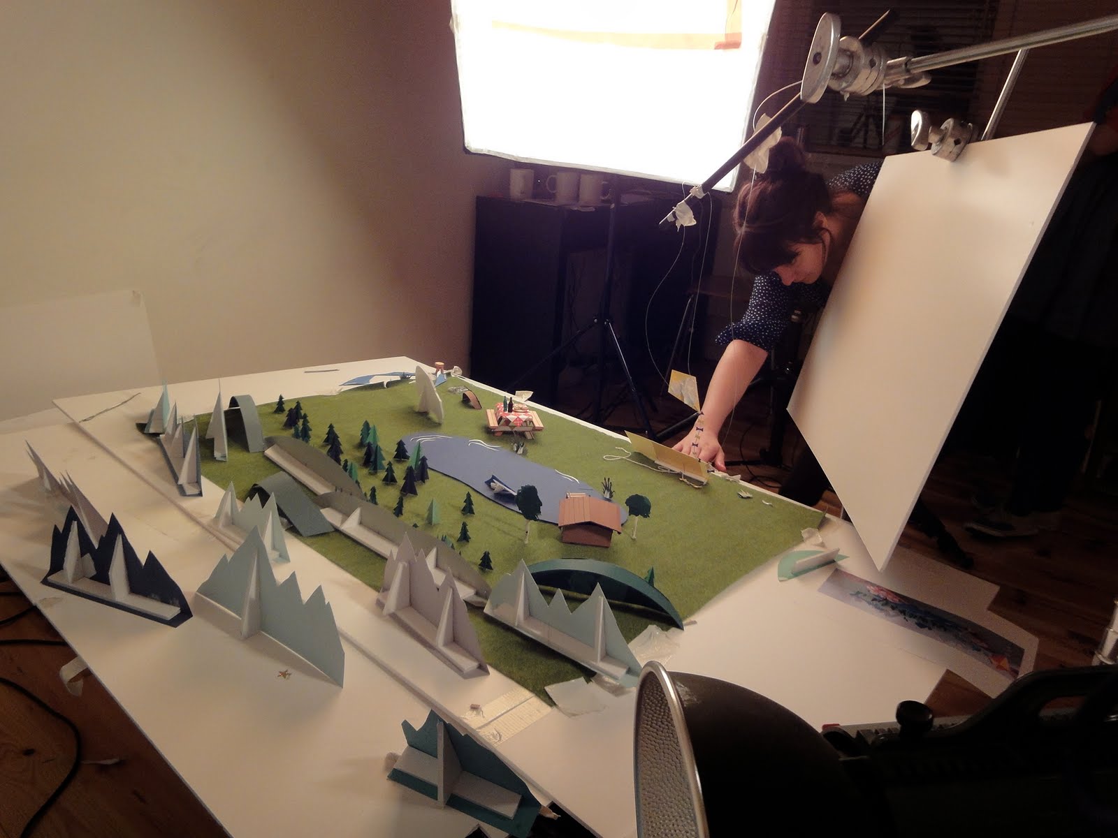
I can now finally show you the video from a DM pack I did last year for Honda. Thanks to Hattie Newman and her team of lovelies for the amazing paper world illustrations
Paper World from Crayon London on Vimeo.
Thursday, October 21, 2010

Monday, October 18, 2010
A little bit of self indulgence.
Been an awfully long time since the last blog post. Mainly because since winning a Sony Pitch 6 months ago, it has been a little non-stop since.
So here's the work that came out of the long slog..
The campaign was entitled "welcome back emotion", the idea comes from the basic insight that we increasingly want more and more from entertainment, we want to experience heightened emotion more that ever. We want to be scared more, cry more and laugh more and now with all the laptop's gadgets and gizmo's watching films, listening to music and playing games has never been so god damn good. In fact your more involved, more entertained and consequently you experience more emotion.
With this concept in mind, we knew that we wanted to make our campaign stand out amongst the competitors. Firstly we wanted colour. So many laptop adverts are full of techy language, mainly black and dull. So within our campaign, we chose 5 emotions to match the top 5 features on the laptop and to make each unique we chose a colour with portrayed the emotion best.
We commissioned Mitch Jenkins, an absolutely fantastic photographer, with a lovely team who was great to work with, completely knew what we wanted and achieved stunning photos and films. We wanted to keep the adverts quite basic and make the portraits and emotions be the focal point.


so here's part of the final result... The films are currently playing on underground digital escalators and will be available to view online soon as rich media and website formats.


Wednesday, August 25, 2010
The Prose and cons of it all
The poem.
Poetry was possibly one of the more interesting parts of my English class but equally one of the hardest to crack. With the recent spate of verse and rhyme hitting our TV screens it’s also becoming something of a creative’s favorite. So why's it become so popular?
The poem does make a nice change to heavily music-laden ads; verse gives an ad substance, rhythm and a reason to believe. A poem, particularly the way they are used, helps a brand to become more approachable as they directly speak to the consumer. Enabling the audience to relate to the brands home truths.
This down to earth approach suits the brands that have used this style and the messages they’re trying to communicate. But, like most advertising trends (which seem to occur as some kind of collective creative subconscious that we all tap into at the same time)becomes harder to distinguish between brands that use the same treatments, styles and tone of voice.
Personally, I like this style of narration; it communicates in a kind of honest yet fun tone. However as it has become so popular it means it’s becoming a little bit like literacy pretty but beige wallpaper.
Here's a collection of some adverts that use poems...
Original:
And if you can't join them, mock them:
Friday, July 30, 2010

Thursday, July 15, 2010
The ideal formula

This is a very long overdue post, of which I have had in my blog drafts for a while. Never the less it's still a very debatable subject. Creating the perfect portfolio always seems to be some sort of magical formula where only a magical circle of creatives can tell you that your book is great. The fact is there really is no right answer of what you should include. Back in May, I read a post on Hey Whipple's blog. Where he talked about what makes an ideal creative candidate and how digital knowledge and work are becoming increasingly important yet this alone will not make you hirable. It's the strength of creativity that makes you worth a paycheck and yes a Creative and not a digital programmer or coder.
I agreed with this post, for example the other week I went to crit some graduate books and I was gob-smacked at how they all looked like Wired magazine. Cut 'n' pasted and slapped into plastic wallets. Did a portfolio full of different new medias impress me? Well er... NO. I know the range of media platforms available to me and so do, it seems, most of the media savvy students. So, out of all the books the one that impressed me the most was actually pretty much straight forward press ads, with a couple of inventions thrown in. This got my attention as it showed they can think, solve problems and persuade people without the crutch of a gimmick or new media.
So back to basics I say, just show people you can think and that it's not the medium that carries your idea. In actual fact the media could be anything and it would still be great. I would like to see brave young creatives go back to basics. By all means show that they feel confident about how to use different media and digital platforms, but an Idea should be able to be written in a few sentences and work without any execution or technique.
Thursday, July 8, 2010
Look what we did...
Been a long time since I last posted but work has got its very large claws stuck in me at the moment cos it's been blumin busy around here!
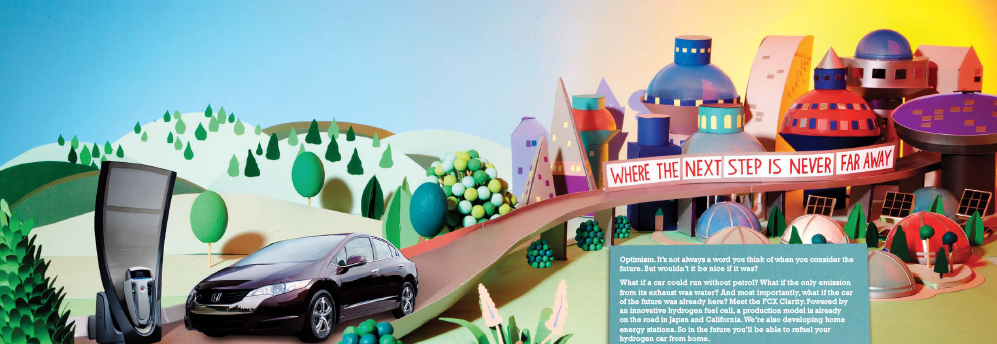
So Here's a little glimpse of a project we did for Honda. We were briefed to come up with a new creative DM pack to display the whole Honda car range and brand. The Idea- "Inspiration is everywhere". Inspiration for making the cars often came from looking at the world around you rather than just staring at a blank piece of paper. We commissioned Hattie Newman to come up with these gorgeous paper sets to which would home the cars. Each set would fit with the characteristics and personality of the car and each set also tells a small story about other Honda products and antics.
There will be a making of video to follow showing the final shots.


Friday, May 21, 2010
Wednesday, May 19, 2010
A change of name
From Last week, Cate and I now work at "Crayon" as HS&P got re-branded to help encompass the group under one roof. Crayon will offer a full digital and direct service for clients such as Sony, Honda, Axa, BT, British Gas and Diagio.


Subscribe to:
Posts (Atom)